You have probably experienced this at least once. You see a color on someone else (a lipstick shade, a sweater, a scarf) and it looks incredible on them. So you buy the same thing, try it on at home, and something is off. The color that made them glow makes you look washed out, tired, or slightly jaundiced. It is not your imagination, and it is not a quality issue. It is a color match issue.
The truth is that certain colors are designed to work with your natural coloring and others are designed to fight it. Your skin tone, hair color, and eye color create a unique set of characteristics that harmonize beautifully with some shades and clash with others. Once you understand the basic principles behind this, choosing flattering colors stops being a guessing game and starts being a reliable, repeatable process.
This guide will walk you through everything you need to know: from a quick starting point based on your undertone, to a detailed decision framework you can use every time you shop, to the full 12-season system that gives you the most precise answer of all.
Start With Your Undertone
Your undertone is the single most important factor in determining which colors look good on you. It is the subtle hue beneath the surface of your skin that stays constant regardless of tanning, blushing, or seasonal changes. Undertone falls into one of three categories: warm, cool, or neutral.
Warm undertones have a golden, peachy, or olive cast to the skin. Warm colors like orange and coral make your skin look refreshed and defined. Gold jewelry often flatters, but the fabric test is more reliable than any single shortcut. Warm-toned people often tan easily and have a yellowish or golden quality to their complexion even in winter.
Cool undertones have a pink, rosy, or bluish cast to the skin. Cool colors like blue and fuchsia brighten your complexion. Silver jewelry often flatters. Cool-toned skin can have a translucent, porcelain-like quality or a deep, richly pigmented depth with blue-red undertones.
Neutral undertones do not pull strongly in either direction. Both warm and cool fabrics look reasonable. Both gold and silver jewelry work. Neutral skin has the widest range of flattering colors, but also the most room for subtle mismatches.
If you are not sure which category you fall into, our complete undertone guide walks you through the most reliable testing methods, including fabric draping and color comparison, to help you pin down your undertone with confidence. Knowing your undertone is the foundation for everything else in this guide, so it is worth spending a few minutes to get it right.
Quick Color Decision Guide
Once you know your undertone, use this decision framework to identify your most flattering shades, and the ones to avoid.
Warm Undertone
Your coloring harmonizes with earthy, sun-kissed hues that have a golden or yellow base.
Always flattering: Coral, warm peach, olive green, terracotta, warm gold, bronze, burnt orange, camel, warm turquoise
Shades to approach with caution: Icy pink, stark white, blue-toned red, fuchsia, silver gray
The logic is straightforward. Warm colors echo the golden quality already present in your skin, creating a seamless, radiant effect. Cool-toned shades introduce a temperature contrast that can make warm skin look sallow or muddy. This does not mean you can never wear cool shades. They work better further from your face (think handbags, shoes, or nail polish) rather than as a lip color or a scarf right next to your jawline.
Cool Undertone
Your coloring is enhanced by colors that carry a blue, pink, or purple base.
Always flattering: Rose, lavender, sapphire blue, emerald green, plum, silver, raspberry, icy pink, true red (blue-based), cool berry
Shades to approach with caution: Orange, warm mustard, rust, peach, yellow-gold
Cool-toned shades complement the pink and blue undertones in cool skin, creating a polished, vibrant look. Warm, earthy shades can clash with that natural coolness and make the complexion look ruddy or uneven. Cool undertones tend to look especially striking in jewel tones: deep saturated colors that have clarity and a cool base.
Neutral Undertone
Your coloring works with a wide range, but you look best in softened, balanced shades that are neither extremely warm nor extremely cool.
Always flattering: Dusty pink, teal, jade green, soft navy, muted rose, blush, medium gray, periwinkle, soft plum
Shades to approach with caution: Neon anything, very warm orange, very cool icy pastels
The advantage of neutral undertones is versatility. You can borrow from both the warm and cool palettes. The disadvantage is that extremely saturated or one-directional shades (a very warm orange or a very cool icy blue) can tip the balance and create a slight mismatch. Your sweet spot is in the middle: colors that have been softened, muted, or blended so they do not pull too far in either direction.
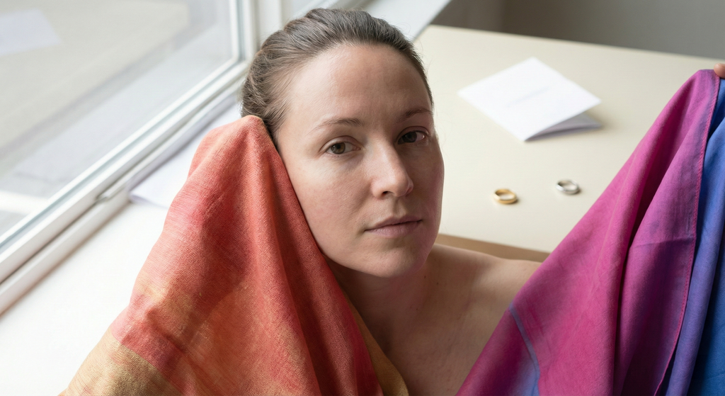
The Jawline Test
When testing a color, hold the fabric or product next to your jawline in natural daylight. Look at your skin, not the color. If your skin looks smoother, brighter, and more even, the color is flattering. If your skin looks dull, uneven, or develops visible redness or yellowing, it is not your shade.
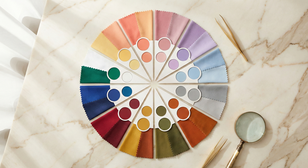
The 12-Season Framework (The Full Picture)
Undertone gives you a solid starting point, but it only tells part of the story. Two people can both have warm undertones yet look completely different in the same warm shade, because they differ in depth (how light or dark their coloring is) and chroma (how vivid or muted their coloring is).
This is exactly why the 12-season color analysis system exists. It takes the three basic undertone categories and refines them further, creating 12 distinct color profiles based on the unique combination of your undertone, depth, and chroma. The result is a specific palette of colors tailored to your exact coloring, far more precise than a simple warm/cool/neutral recommendation.
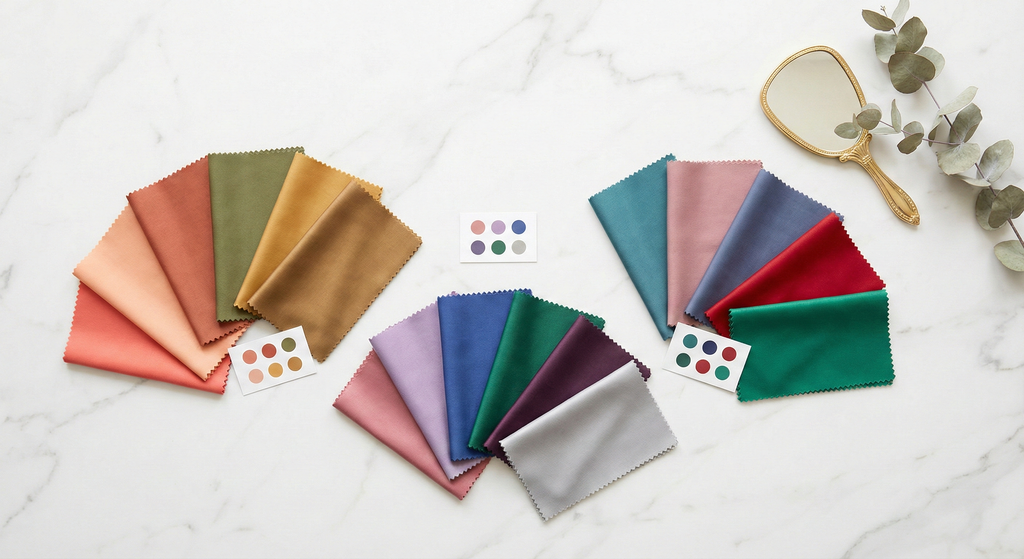
Here is a compact overview of all 12 seasons with their signature shades:
| Season | Key Quality | Signature Colors |
|---|---|---|
| Light Spring | Warm-Neutral + Light | Peach, warm coral, soft aqua |
| True Spring | Pure Warm | Coral, turquoise, marigold |
| Bright Spring | Warm-Neutral + Vivid | True red, hot pink, cobalt |
| Light Summer | Cool-Neutral + Light | Powder blue, dusty rose, lavender |
| True Summer | Pure Cool | Raspberry, steel blue, plum |
| Soft Summer | Cool-Neutral + Muted | Sage green, dusty mauve, soft lilac |
| Soft Autumn | Warm-Neutral + Muted | Warm taupe, terracotta, muted olive |
| True Autumn | Pure Warm + Rich | Burnt orange, olive, bronze |
| Dark Autumn | Warm-Neutral + Deep | Burgundy, forest green, rust |
| Dark Winter | Cool-Neutral + Deep | Deep crimson, emerald, dark navy |
| True Winter | Pure Cool + High Contrast | True red, sapphire, fuchsia |
| Bright Winter | Cool-Neutral + Vivid | Hot pink, cobalt, jade green |
Notice how the 12-season system resolves the ambiguity that a simple warm/cool/neutral framework cannot. A Light Spring and a Dark Autumn are both warm, but they need completely different palettes. A Light Spring looks best in soft peach and warm aqua. A Dark Autumn looks best in burgundy and forest green. The undertone is the same, but the depth and chroma are entirely different.
If you want the most precise, actionable answer to "what colors look good on me," the 12-season system is the way to get it. Our complete color analysis guide explains the system in detail and includes guidance on identifying your specific season.
Find Your Exact Color Season
BeautySpark uses AI to analyze your skin tone, hair color, and eye color to determine your precise 12-season color palette. No guesswork needed.


Colors That Flatter Every Skin Tone
While your undertone and season determine your most precise matches, a handful of colors manage to look good on nearly everyone. These are the universal crowd-pleasers, useful to know when you are shopping quickly or buying a gift for someone else.
Teal. This blue-green sits at the exact midpoint between warm and cool, which means it does not clash with either undertone. It has enough depth to add richness without overwhelming lighter complexions, and enough vibrancy to stand out against deeper skin tones. Teal is one of the most universally flattering colors in existence.
Dusty Rose. A muted, slightly gray-toned pink that avoids the pitfalls of both warm peach (too warm for cool skin) and icy pink (too cool for warm skin). Dusty rose reads as soft, elegant, and natural against virtually every complexion. It is especially effective as a blush or lip shade because it mimics the natural flush of the skin across a wide range of skin tones.
True Red (balanced). Not orange-red and not blue-red, but a balanced, medium red that splits the difference. A true red with equal parts warmth and coolness manages to complement both ends of the undertone spectrum. The secret is avoiding reds that lean too far in either direction.
Soft Navy. Softer than stark black but with similar depth, navy provides a flattering frame for the face without the harshness that pure black can create on lighter or muted complexions. Navy enhances the whites of the eyes and brings clarity to every skin tone. It works especially well as a clothing color near the face or as an eyeliner shade.
Emerald Green. Like teal, emerald green strikes a balance between warm and cool. It has enough blue to please cool undertones and enough warmth to avoid looking icy on warm skin. Emerald is also one of the few colors that enhances every eye color: it makes brown eyes look richer, blue eyes look brighter, and green eyes look more vivid.
The reason these colors work universally comes down to balance. They sit near the middle of the warm-cool spectrum and have moderate saturation: neither too muted nor too vivid. When in doubt, these are safe bets.
How to Test Colors on Yourself
Even with a solid understanding of undertones and seasons, there is no substitute for testing colors against your own skin. Here are the most reliable methods.
Use natural lighting. Artificial light distorts color. Fluorescent lights add a cool, greenish cast. Warm indoor lighting adds yellow. For the most accurate test, stand near a window during daylight hours, ideally with indirect sunlight rather than harsh direct rays. If you are shopping in a store, step near the entrance or a window before making a decision.
Test with a bare face. Makeup creates a filter between the test color and your actual skin. Foundation, concealer, and even moisturizer with a tint can shift the way a color reads against your complexion. For the most honest result, test against clean, bare skin.
Compare near your jawline, not your hand. Your hand is often a different shade than your face and neck due to sun exposure. Hold the fabric, swatch, or product next to your jaw or collarbone, which is the area where the color will actually sit when you wear it.
Test two shades side by side. Color assessment is comparative. Your brain is much better at spotting a mismatch when it has a reference point. Hold a warm shade and a cool shade of the same color family next to your face, one at a time. One will immediately make your skin look smoother and healthier. That is your match.
Look at your skin, not the color. The natural instinct is to stare at the fabric or swatch and decide if you "like" the color. That is about preference, not flattery. Instead, look at what the color does to your skin. Does it even out your complexion? Does it bring warmth or brightness to your face? Or does it create visible redness, yellowing, or a dull, washed-out look?
Photograph the comparison. Sometimes it is hard to judge the effect in real time because your brain adjusts. Take a photo with each option held near your face. When you compare the photos side by side on your phone screen, the difference is often dramatically more obvious than it was in the mirror.
Lighting matters more than you think
A color that looks perfect under bathroom lighting might look completely different in daylight. Always do your final check near a window with natural light. If you are shopping in a store, use your phone camera near the entrance to capture how the color reads in neutral light.
Let AI Find Your Perfect Palette
If you want to skip the guesswork entirely, BeautySpark can analyze a selfie and determine your exact 12-season color palette in under five minutes. The AI evaluates your skin tone, hair color, eye color, and the contrast between them to place you in one of the 12 seasons and generate a full set of flattering shades, including specific makeup looks tailored to your coloring and eye shape.
Frequently Asked Questions
Discover the Colors That Were Made for You
Download BeautySpark and get your personalized 12-season color palette with AI-powered makeup recommendations tailored to your exact skin tone, eye color, and features.