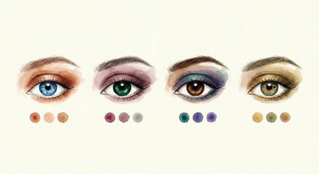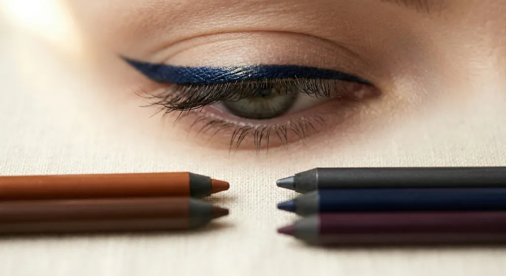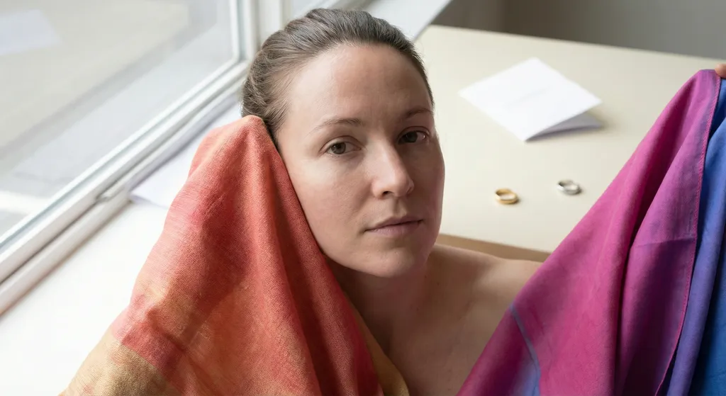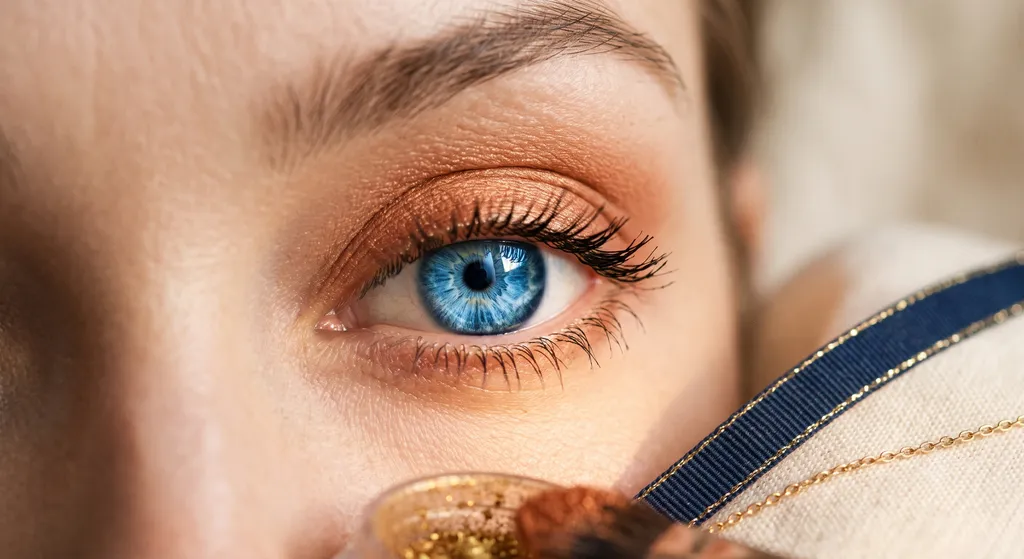
Eyemaxxing is the goal of making your own eyes as striking as they can be. The method TikTok has settled on is the color wheel: pick eyeshadow and eyeliner from the opposite side of the wheel from your eye color, so the contrast makes your iris look more vivid. It's everywhere on TikTok right now, in 2026, and the color theory behind it is real. The problem is the chart telling you which shade to buy. It reads your eye as one of four labels, and a label is not a color.
Eyemaxxing means maxing your own eyes, not the "average" version of your eye color. The color wheel hands you a hue family and stops there, and it does that at both ends: it never asks which orange you should wear, and it never asks which blue you actually have. That means blue eyes are always handed rust, but here is how rust actually looks on a True Summer's blue eyes. Green eyes are handed burgundy, but look at how it sits on a Light Summer. Brown eyes are given purple, yet it falls flat on a True Autumn. Each example follows the rule to the letter, and each one fails. This is exactly why the old "opposite eye color" rule just doesn't hold up.
How Eyemaxxing Actually Started
The term picked up steam on TikTok in the first half of 2026, but the technique behind it isn't new. One beauty writer described using the same complementary shadow trick a decade earlier, noting that it "was eyemaxxing before 'maxxing' was ever a thing." The current wave also rides alongside a broader, more maximalist mood pushing back against the pared-down "clean girl" look that dominated the last few years: more color, more contrast, less concealment.
What changed is the framing, not the method. "Making your eyes pop" used to be vague advice with no real system behind it. Eyemaxxing packages the same idea into a rule anyone can follow: find your eye color on the wheel, then reach for whatever sits opposite it.
That packaging is exactly the problem. The rule that made it into a fifteen-second video kept the hue family and dropped everything else, and what got dropped happens to be the part that decides whether the shade actually works on your face.
The complementary color theory behind eyemaxxing isn't new. The four-row chart teaching it is, and the missing nuance is what this article fixes.
What TikTok Says About Eyemaxxing
The rule circulating on TikTok is straightforward, and credit where it's due: it isn't entirely wrong. Makeup artist Ellen Malone walked through the logic for IBTimes UK, and the core mechanic is legitimate complementary color theory that professional makeup artists have used for years. The mechanic is sound. What it gets pointed at is not.
On the traditional artists' color wheel, complementary colors sit directly opposite each other: orange and blue, red-violet and green, purple and yellow. Placed side by side, each half of a complementary pair makes the other look more saturated. That much is settled color theory, and it's the entire basis of the trend: put an orange-family shade next to a blue eye and the blue reads more vivid.
But that mechanic only describes two colors sitting next to each other. It says nothing about the face those two colors are sitting on, and nothing about which orange or which blue we're actually talking about. Both of those turn out to decide the result.
The Chart Going Viral
This is the rule going viral. The theory behind it holds. What it's being applied to doesn't. Here is what it leaves out.
| Eye Color | Complementary Family | What TikTok Says to Wear |
|---|---|---|
| Blue | Orange family | Copper or warm terracotta |
| Green | Red-violet family | Burgundy or red-toned plum |
| Brown | Violet family | Purple or plum |
| Hazel | Red-violet family | Burgundy, leaning purple for gold flecks or red for green flecks |
Four rows, four shades, and that is the whole system as it circulates. Even creators posting under the trend name don't stay inside it: one widely shared eyemaxxing routine drops the purple-for-brown-eyes logic entirely in favor of a cool-toned black smoky eye, a different technique wearing the same name. What the chart actually hands you is a hue family, and a hue family is one of four things that decide whether a shade flatters you.
The mechanic underneath eyemaxxing is real color theory. The chart built on top of it isn't. A row saying "blue" is a label, not a color, and your actual eye has a temperature, a clarity and a depth the chart never asked about.
Why the Rule Breaks: The Chart Complements a Label, rather than your eye
Every color has four properties, and a color wheel plots exactly one of them.
Hue family. Orange, red-violet, purple. Which side of the wheel the color sits on. This is the only thing a color wheel shows you.
Temperature. Warm or cool. Not the same thing as the hue family, and this is where the trend falls apart. Some families hold both versions: plum can lean warm or blue-violet, green can lean olive or blue-green. Some hold only one. Orange is warm, always, at every depth and every level of dustiness. The wheel doesn't know any of this, so it points every blue eye at the orange family without noticing that a good half of them have no version of it to wear.
Clarity. Bright and clear, or muted and dusty. The wheel is silent on this.
Depth. Light or deep. The wheel is silent on this too.
Here's the part the trend misses completely: your eye has all four of these properties too. "Blue" is a hue family, not a color. A True Autumn's blue eye is warm, muted and teal-leaning. A True Winter's blue eye is cold, clear and steel. They sit on the same spot on the wheel, they are not the same color, and they do not have the same complement.
That's why the chart fails. Complementary color theory is not wrong. The chart is just complementing the label instead of the eye.
"Orange" is a family. Rust, terracotta, burnt copper, a bright clear copper, warm coral and a soft muted apricot all sit in it, and they are not interchangeable. Every one of them is warm, because that's the only thing orange comes as. What separates them is clarity and depth. Only one of them belongs on any given warm face, and the rest will fight it on one of those two even though the hue family is identical for all six.
It's the same distinction our eyeshadow and eye color guide draws when it splits every eye color into a warm-season palette and a cool-season palette instead of handing out one shade per eye color. Your undertone, which you can check in our undertone guide, tells you which side of that split you're on. Your full season tells you where inside it to land.
Most people who try eyemaxxing and don't love the result blame their eye color, or decide they "can't wear color." Neither is what happened. A rust that turns you sallow is evidence that this rust was mixed for a warmer face than yours, and no amount of dusting it down or lightening it will change that. Orange doesn't come in your temperature. What it does come in is a version of the same effect, built from the family your palette actually holds, and that's what the rest of this article is for.
Once you're looking at every property instead of just the hue family, a shade stops being a yes-or-no question. It sits somewhere on a four-point scale:
- Made for you. Every property matches. The shade looks like it was mixed for your specific face.
- Wearable. One property is off, and it's clarity or depth. It reads a little dull or a little heavy. Nothing looks wrong, and it works fine in a pinch.
- Fighting you. The temperature is off. The iris might brighten, but the skin goes sallow or gray. This is the zone where most people quietly decide they "can't wear color."
- Actively wrong. The temperature is off and so is the clarity or the depth. It reads as a mistake at a glance, no caption needed.
That scale is what the next three sections prove, shade by shade, season by season.
A color is defined by its hue family, its temperature, its clarity and its depth together, and a color wheel only ever tells you the family. That is true of your eyeshadow, and it is just as true of your eye.
Proof: Rust on Blue Eyes, Five Seasons
The trend says blue eyes want orange, and rust is the shade circulating the most right now. Here's the same rust eyeshadow, same placement, same lighting, worn by five color seasons that all technically have "blue eyes."
| Season | Verdict | Why | Better Option If Not Ideal |
|---|---|---|---|
| True Autumn | Made for you | Warm, muted, medium depth. Exact match on every property. | - |
| Soft Autumn | Made for you | Same warm, muted, medium-depth match as True Autumn, just softer. Soft Autumn's own palette already leans on dusty, earthy tones like terracotta. | - |
| True Spring | Wearable | Temperature is right, so nothing clashes outright. But her blue eye is clear and rust is dusty, so rust isn't the complement of the eye she actually has. It flattens Spring's clarity into something a shade muddy. | Clear vivid copper or warm coral |
| True Summer | Fighting you | The mutedness actually matches. The warmth doesn't. The iris pops, but the skin goes sallow and the eye area reads tired instead of brighter. | Cool rose-brown or muted mauve |
| True Winter | Actively wrong | Fails temperature and clarity. Winter wants cool and clear; rust is warm and dusty. Nothing about it agrees with the rest of the face. | Cool charcoal-plum or deep cool mauve |
- Prime the lid with a warm-toned eye primer so the powder has something to grip
- Sweep warm muted rust #A85A32 across the whole mobile lid with a flat brush, one even pass
- Blend terracotta #8A4030 through the crease with a fluffy brush, keeping the top edge diffused
- Line the upper lash line with deep warm espresso #3A1A08, soften it with a smudger, then clear any fallout from under the eye
- Finish with deep warm brown mascara on upper and lower lashes
True Autumn, blue eyes, rust eyeshadow. The shade and the face are speaking the same language: warm, dusty, medium-deep. The iris lifts, and nothing else on the face has to compensate.
- Even out the lid with a neutral primer or a thin veil of concealer
- Wash the hazier end of the same rust #A06A4C over the lid, building in sheer layers rather than one dense pass
- Soften the crease with muted warm taupe #B89878, blending in small circles until no edge is visible
- Smudge a soft warm brown pencil #806848 along the upper lash line and the outer third of the lower line
- Finish with warm brown mascara, which suits Soft Autumn's softer coloring better than black
Soft Autumn, blue eyes, the same rust. Pushed toward the hazier end of the shade rather than the richer end, it sits just as comfortably here as it does on True Autumn.
- Start with a warm-toned primer so the shadow does not settle into the texture of a fine lid
- Sweep the same warm rust #A85A32 across the mobile lid with a flat brush
- Blend warm peach #D4866A through the socket to lift the dustiness of the rust back toward Spring's natural clarity
- Line the upper lash line with a warm brown pencil #7A3A22 and smudge it out with a cotton swab
- Finish with warm brown mascara and leave the lower lash line clean
True Spring, blue eyes, the same rust. The warmth agrees with the skin. The dustiness doesn't agree with Spring's natural clarity, and the whole look reads a shade duller than it should, as our eyeshadow and eye color guide breaks down in more depth.
- Prime the lid and let the base set before any powder goes down
- Press the same rust #A85A32 onto the mobile lid, keeping it below the crease
- Blend cool mauve #C4A8B8 through the crease, the transition True Summer's own palette gives her
- Line the upper lash line with cool plum-gray #605068 and smudge it softly outward
- Finish with soft black mascara, the mascara her cool coloring calls for
True Summer, blue eyes, the same rust. The dustiness happens to match her, which turns out to count for very little. Her blue is a cool blue, and no orange answers a cool blue. The warmth settles into her skin instead, and the eye reads tired rather than brighter.
- Prime the lid with a neutral base
- Pack the same rust #A85A32 across the lid with a flat brush
- Deepen the crease and outer corner with cool charcoal #404850 from True Winter's own palette
- Line tight to the upper lashes with pure black kohl #101018 and carry a thin line along the lower lash line
- Finish with two coats of black mascara
True Winter, blue eyes, the same rust. Warm against cool, dusty against clear: two mismatches at once, and the eye area reads like a mistake rather than a look.
The True Spring row is the one worth sitting with. The temperature is correct here and the shade still underperforms, which looks like an exception until you look at her eye. A True Spring's blue eye is warm and clear, and the complement of a warm, clear blue is a clear copper. Rust is the complement of a dustier eye than hers, which is why it lands on True Autumn and not on her.
That's the pattern in every row above. Nothing is wrong with rust, and nothing is wrong with anybody's eyes. Rust suits one particular kind of coloring, and a chart that never looked at any of these five faces handed it to all of them anyway.
Rust is a True Autumn shade at heart. Put it on a warm face that runs clearer or deeper and it's still wearable. Put it on a cool face and it fights, and there is no cooler rust to swap to. Miss on two properties at once and it's a mistake.
Proof: Burgundy on Green Eyes, Same Trend, Different Failure
The trend says green eyes want red-violet, and burgundy is the shade circulating the most. This second set isn't here to repeat the first one. It's here to show that temperature is most often the property that decides it, and that what makes a mismatch worse changes from shade to shade.
Rust punishes Winters hardest. Burgundy punishes the lighter seasons hardest, because depth is the loudest thing about burgundy and a light face has less room to absorb it. Temperature is why neither shade works on a cool face to begin with. What makes the damage worse is different each time: clarity for rust, depth for burgundy.
| Season | Verdict | Why | Better Option If Not Ideal |
|---|---|---|---|
| True Autumn | Made for you | Warm, deep, softly muted. Exact match. | - |
| Dark Autumn | Made for you | Warm and deep in the same way the shade is. Her palette already lives at this saturation. | - |
| Soft Autumn | Wearable | Right temperature, slightly too saturated. | Earthy warm mauve or dusty reddish plum |
| Dark Winter | Fighting you | Depth matches; temperature doesn't. A Dark Winter's green eye is a cool green, and a warm burgundy is not its complement. | True cool wine or deep cool berry |
| Light Summer | Actively wrong | Fails depth and temperature. The shade is heavier than the whole face and warm against cool coloring. It swamps the eye. | Cool mauve, soft lavender, or dusty pink-plum |
- Even out the lid with a warm-toned primer
- Press warm burgundy #7B2E38 across the lid and into the outer corner
- Blend terracotta #8A4030 through the crease so the burgundy fades into warmth rather than stopping at an edge
- Line the upper lash line with deep warm espresso #3A1A08, then smudge the same warm burgundy #7B2E38 along the lower line
- Finish with deep warm brown mascara on upper and lower lashes
True Autumn, green eyes, burgundy eyeshadow and liner. Depth, warmth, and mutedness all land in the same place the face already lives.
- Prime the lid so the deepest shades stay where they are placed
- Build the same burgundy to full richness #5E1F2A, pressing rather than sweeping for maximum depth
- Blend oxblood-brown #603018 through the crease and outer V
- Tightline and line the upper lash line with near-black espresso #2A1008
- Finish with a warm-toned black or a very deep brown mascara, either of which Dark Autumn can carry
Dark Autumn, green eyes, the same burgundy pushed to full strength. The extra depth doesn't fight anything; Dark Autumn's whole palette lives this deep already.
- Prime the lid with a neutral base
- Wash the same burgundy #7B2E38 over the lid in sheer layers, stopping short of full saturation
- Haze the crease with muted warm taupe #B89878 until the burgundy has no hard edge left
- Smudge a soft warm brown pencil #806848 along both lash lines
- Finish with warm brown mascara
Soft Autumn, green eyes, the same burgundy. The warmth is correct. The saturation isn't. Against Soft Autumn's softer palette, the shade reads a touch too rich rather than wrong.
- Prime the lid and set the base
- Press the same burgundy #7B2E38 across the lid
- Deepen the crease and outer corner with deep cool plum #383040 from Dark Winter's own palette
- Line the upper lash line and waterline with near-black kohl #181820
- Finish with black mascara on upper and lower lashes
Dark Winter, green eyes, the same burgundy. The depth lands right where Dark Winter wants it. The warmth doesn't, and the shade starts to look muddy instead of moody.
- Prime the lid with a light neutral base
- Sweep the same burgundy #7B2E38 across the lid in one sheer pass
- Blend cool mauve-taupe #C8B8C0 through the crease, the transition Light Summer's own palette gives her
- Trace the upper lash line with soft cool gray #807080, keeping the line thin
- Finish with soft black mascara on the upper lashes only
Light Summer, green eyes, the same burgundy. Too deep and too warm at once, on the lightest, coolest face in this set. The shadow reads heavier than the person wearing it, and again, that's the shade's failure, not hers.
Same trend, same wheel, and the worst result lands on two seasons that share almost nothing on the surface: rust wrecks True Winter, burgundy wrecks Light Summer, one of them dark and clear, the other light and soft. What they share is temperature, and it's the biggest reason either result goes wrong. Both are cool, and the chart sent both of them to a warm shade without ever asking.
Temperature alone doesn't decide everything, though. Put a Dark Winter in that same burgundy and the result is merely fighting her coloring, not actively wrong, because her depth still matches even though her temperature doesn't. Light Summer's depth is off too, and that combination is what pushes her into the worst result in the set. A four-row chart can't hold that much nuance. A face can.
Burgundy's dominant property is depth, where rust's is clarity, so the two shades break on different variables. Which one breaks changes with the shade, which is exactly why one chart per eye color was never going to be enough.
Your Eye Color Is Only Half the Story
BeautySpark uses AI to match your eye makeup to your full color season, not just a color-wheel guess.


Proof: Purple on Brown Eyes
"Brown" is the loosest label of the four. It covers everything from a warm golden hazel-brown to a cold near-black, which makes brown eyes the best test of whether a single chart row can serve a whole eye color.
| Season | Verdict | Why | Better Option If Not Ideal |
|---|---|---|---|
| True Winter | Made for you | Cool, clear and deep. The shade and the face agree on every property. | - |
| Dark Winter | Made for you | Cool and deep in the same way the shade is, and her palette carries it at full strength. If anything, take it deeper rather than lighter. | - |
| Soft Summer | Wearable | The temperature is right, the clarity isn't. A clear violet against a naturally soft face reads a little sharp. | A hazy dusty plum |
| Bright Spring | Fighting you | The clarity matches, the temperature doesn't. The eye lifts and the skin goes flat. | Warm bronze or burnished gold |
| True Autumn | Actively wrong | Fails temperature and clarity at once, warm muted coloring under a cool clear violet. | Warm bronze, burnished gold or deep olive |
- Prime the lid so the violet keeps its clarity through the day
- Pack clear cool violet #6B3FA0 across the lid with a flat brush, building to full intensity
- Blend cool charcoal #404850 through the crease and outer V for depth
- Line the upper lash line with pure black kohl #101018, carrying it just past the outer corner
- Finish with two coats of black mascara
True Winter, brown eyes, the same clear cool violet. Cool, clear and deep in exactly the register she is. For once the viral chart's advice needs no correction at all.
- Prime the lid with a neutral base
- Press the same clear cool violet #6B3FA0 across the lid, taking it as deep as the pigment will go
- Blend deep cool plum #383040 through the crease and outer corner
- Line the upper lash line and waterline with near-black kohl #181820
- Finish with black mascara on upper and lower lashes
Dark Winter, brown eyes, the same clear cool violet. Her coloring runs just as cool and deep as the shade does, so it sits as easily on her as it does on True Winter.
- Prime the lid and let the base tack
- Wash the same clear cool violet #6B3FA0 over the lid in sheer layers
- Diffuse muted cool taupe #B8A8B0 through the crease to soften the edges of the violet
- Smudge muted gray-plum #787078 along the upper lash line and the outer third of the lower line
- Finish with soft black mascara
Soft Summer, brown eyes, the same clear cool violet. The temperature is right. The clarity isn't, and it reads sharp against Soft Summer's naturally soft palette.
- Prime the lid with a sticky base for full pigment payoff
- Pat the same clear cool violet #6B3FA0 onto the lid, pressing rather than sweeping
- Blend bright warm peach #CC7A48 through the crease, the transition Bright Spring's own palette gives her
- Line the upper lash line with warm amber-brown #884422 and smudge the outer third
- Finish with deep warm brown mascara
Bright Spring, brown eyes, the same clear cool violet. The clarity is right at home. The coolness isn't, and it drains the warmth that makes Bright Spring look alive.
- Prime the lid with a warm-toned base
- Sweep the same clear cool violet #6B3FA0 across the mobile lid
- Blend terracotta #8A4030 through the crease, the shade True Autumn's own palette hands her
- Line the upper lash line with deep warm espresso #3A1A08 and soften it with a smudger
- Finish with deep warm brown mascara
True Autumn, brown eyes, the same clear cool violet. Cool against warm and clear against muted, two misses at once, and the eye area reads like a mistake rather than a look.
Even the loosest label still has a wrong answer. The trend does land closer to right on brown eyes than on blue or green, and it's worth saying why: violet is a family that spans both temperatures, so it isn't a dead end the way orange is for a cool blue eye. That's not the same as this chart working. Every model above is wearing the cool version, and nothing here shows you the warm one or tells you which is yours. Landing closer to right on this row is luck, not the chart getting smarter.
What It Looks Like When It's Right
Three of the women above, each wearing the shade the chart sent her to, and then the one her season actually calls for.
True Winter, blue eyes, in rust, the shade the chart sent her to.
- Prime the lid with a neutral base
- Press deep cool charcoal-plum #453347 across the lid and into the outer corner
- Blend cool charcoal #404850 up through the crease so the depth fades rather than stops
- Line tight to the upper lashes with pure black kohl #101018 and carry a thin line along the lower lash line
- Finish with two coats of black mascara
True Winter, blue eyes, in deep cool charcoal-plum, the shade her season actually calls for.
Light Summer, green eyes, in burgundy, the shade the chart sent her to.
- Prime the lid with a light neutral base
- Sweep cool mauve #C9AEC2 across the lid, where one sheer pass is enough for Light Summer's delicate coloring
- Blend cool mauve-taupe #C8B8C0 through the crease, keeping the whole eye inside a narrow band of depth
- Trace a thin line of soft cool gray #807080 along the upper lash line
- Finish with one coat of soft black mascara
Light Summer, green eyes, in cool mauve, the shade her season actually calls for.
Brown eyes, in the clear cool violet the chart sent her to.
- Prime the lid with a warm-toned base
- Press warm amber bronze #B86820 across the lid with a flat brush, building to a metallic finish
- Blend terracotta #8A4030 through the crease and outer V
- Line the upper lash line with deep warm espresso #3A1A08 and smudge it into the roots
- Finish with deep warm brown mascara on upper and lower lashes
The same eyes, in warm bronze, the shade her season actually calls for.
Nothing changed but the shade. Same eyes, same face, same lighting. And in every one of the three, the shade that works is one the color wheel would never have pointed her to, because the wheel never had more than a rough label for her iris to begin with, let alone the rest of her face.
Three corrections, and not one of them is the color wheel's complement. The wheel never had more than a label for her iris in the first place. These are what her whole face actually asked for.
What Actually Works, by Eye Color and Season
Forget the single-shade chart. Here's the version that holds up, pulled directly from our eyeshadow and eye color guide.
| Eye Color | Warm Seasons (Spring / Autumn) | Cool Seasons (Summer / Winter) |
|---|---|---|
| Blue | Copper, bronze, terracotta | Cool taupe, cool rose-brown, muted mauve, slate |
| Green | Warm burgundy, rose gold, reddish plum | Cool mauve, cool wine, cool berry |
| Brown | Warm bronze, burnished gold, forest green | Deep purple, navy, crisp teal |
| Hazel | Gold, copper, deep olive | Cool plum, dusty mauve, teal |
Two cells in this table intentionally break the standard complementary color rule. Here is why:
First, look at the cool options for blue eyes. The direct complement to blue is orange. However, true orange is an inherently warm color with no cool version. Because cool seasons (Summers and Winters) cannot wear orange, every shade in their cell has to abandon the complement rule. Instead, options like cool taupe and slate rely on depth and cool undertones to frame the eye.
Second, look at the cool options for brown eyes. The direct complement to brown is purple. While deep purple perfectly follows the rule, navy and crisp teal step outside of it. They skip the direct-opposite relationship, working instead as cool-toned, depth-based alternatives that give you more choices.
Find your eye color in the left column, then pick warm or cool based on your color season. If you don't know your season yet, get a full color analysis first. It's the one input the wheel never asks for, and it's the input that decides which column is actually yours.
Clarity and depth still vary within each column by sub-season, and the column doesn't tell you which end of it you belong at. A True Autumn and a Dark Autumn can both wear the warm blue-eye shades at full clarity, while a Soft Autumn wants the same shades hazed down and dustier. The cool side spreads the same way: a Bright Winter takes slate or cool mauve at full clarity, where a Soft Summer needs both of them softened, even though the column calls them both cool.
When Your Complement Doesn't Exist in Your Palette
There is one place where cool seasons hit a genuine wall, and it isn't where you'd expect. Green eyes are fine: the viral shade is a warm burgundy that isn't in your palette, but the red-violet family it belongs to does have cool members, and a true cool wine or a deep cool berry is the complement of your actual green eye.
Blue eyes are the real problem. The wheel sends every blue eye to orange, and orange has no cool version at any depth or any level of dustiness. If you're a cool season with blue eyes, there is no shade in that family for you to find. That doesn't leave you stuck with a flat, contrast-free look.
Depth can do the job the hue family normally does: a deep cool charcoal-plum or a true navy creates as much contrast against a light iris as a hue-based complement does, without borrowing a single warm undertone. It's the piece most eyemaxxing content leaves out entirely, because a color-wheel chart only knows how to reach sideways across the wheel. It has no instructions for reaching down into depth instead.
A cool season with green eyes has her complement already, once she stops reaching for the viral version of it. A cool season with blue eyes doesn't, because orange has no cool version. That's when you reach for depth instead of hue family, pitched to what your own season can carry, and get the same pop without the clash.
How to Actually Eyemax
Same four steps as any eyemaxxing tutorial you've seen. One extra step goes in front of them, and it's the step that decides which colors belong in steps two and four.
- Know your season first. Everything below assumes you already know whether you run warm or cool, and which sub-season you are. If you don't, get your color season before you pick up a shadow brush. Skipping this step is exactly how the trend goes wrong.
- Sweep your shade from the table above across the lid and blend it out. Start with the shadow. It creates fallout, and you want any stray powder handled before doing precise linework.
- Clean up any fallout along the lower lash line with a dry cotton swab or a spoolie before it sets.
- Optionally, line your waterline in a colored liner from the same hue family as your shadow, in your temperature. Doing this after the shadow keeps the line crisp instead of burying it under leftover powder.
- Finish with mascara that matches your season, not the vibe you're going for. Warm-toned brown suits the lighter and softer warm seasons, and black belongs on the cool ones. A Dark Autumn sits in both camps, warm and deep at once, and can carry a warm-toned black or a very deep brown.
That's the baseline, and it will already beat anything the viral chart hands you. It's also one shade on a lid, and your season can carry a great deal more than that.
Every eyeshadow look guide on this site already works this way: shades chosen from a full color season, not a single eye color. BeautySpark was doing eyemaxxing before the trend had a name. If you'd rather skip the assembly, the BeautySpark app builds a look around your own face from a selfie.
Know your season before you open a palette. Everything after that is the same four steps eyemaxxing tutorials already teach; the difference is which shade goes in them.
Eyemaxxing Is Personal. That's the Whole Point.
Real eyemaxxing was never "find your eye color, buy the opposite shade." Every face in this article had "blue eyes" or "green eyes" by the trend's own logic, and the same shade was a match for some of them and a mistake for others, because "blue" and "green" are labels covering a dozen different actual colors. Complementary color theory works. It just has to be pointed at your eye instead of at your eye's category. Your color season is what narrows "blue" or "green" or "brown" down to the specific version you actually have.
BeautySpark identifies your season from a selfie, then builds your eye makeup recommendations around all four properties at once, not just the hue family. Try it before your next eyemaxxing look and skip the guessing entirely.
Eyemaxxing means maxing your eyes, not the average version of your eye color. The color wheel gets you a hue family. Your color season narrows that family down to the exact version your eye actually has.
Frequently Asked Questions
Discover Your Perfect Eye Look
Get your first AI-personalized look in under 5 minutes.