Most fairycore tutorials reach for the same soft lavender, blush pink, sage, and gold mix regardless of who is wearing it. That mix already leans warm enough to suit Spring and Autumn coloring, but it falls short on Summer, which needs pure silver instead of gold, and on Winter, which needs more depth than a soft pastel wash carries. This guide keeps the fairycore technique constant (glowing skin, iridescent shimmer, delicate linework) while matching the palette, depth, and motif to each of the 12 color seasons.
Find your color season from a selfie and get a personalized eye makeup lookWhy One Fairycore Palette Does Not Work for Every Season
The standard fairycore tutorial treats one mix, soft lavender, blush pink, sage green, and gold shimmer, as universal, without asking whose undertone or depth it was actually built for. That mix already carries real warmth, thanks to the gold and the blush, which is exactly why it happens to read well on Spring and Autumn coloring even when nobody adjusts it on purpose. Summer coloring is where it breaks first: Summer needs a purely cool, silver-based palette, and the gold shimmer that makes the standard mix work elsewhere turns muddy rather than luminous against a cool undertone. Winter coloring, and Dark Autumn's depth, break it from the other direction. Regardless of temperature, the soft, sheer pastel weight of the standard mix gets lost against that much natural contrast or depth, and reads pale and washed out instead of glowing.
The fix keeps fairycore's core mood and technique (sheer glowing base, iridescent shimmer, delicate linework, a nature-inspired motif) while swapping the palette to match your own undertone, depth, and chroma. Find your color season before picking a palette, then use the look built for it.
Fairycore lives in the technique. Match the standard lavender-blush-sage-gold mix to your own season instead of copying it as-is, and the whimsy gets stronger.
How This Fairycore Makeup Guide Works
Every one of the 12 looks starts from the same three-part structure: a soft wash blended into a floated crease, a pressed point of shimmer over the pupil, and a thin trace of liner along the lash line. What separates one look from the next is which single element takes the lead as the signature accent, then a whimsy layer of freckles, dots, or a small motif on top. Six accent patterns rotate across the 12 seasons.
- Dewy Petal Wash (Light Spring's "Dawn Meadow Fae"): the base structure pulled all the way back. Wash and crease stay soft, the shimmer point stays tight rather than swept wide, and the liner nearly disappears, with nothing pushed forward as a loud accent.
- Gossamer Shimmer Point (True Spring's "Wildflower Fae," Soft Autumn's "Golden Moss Fae," Bright Winter's "Crystal Frost Fae"): the shimmer point carries the whole look, pressed firm and concentrated on the brighter seasons (True Spring, Bright Winter) and softened into a glow for Soft Autumn's muted chroma. True Spring and Soft Autumn press it in gold; Bright Winter presses the same technique in silver, never gold, matching cool Winter's palette rule. No fine vine or dew accent does the work here.
- Vine & Leaf Graphic Liner (True Summer's "Misty Lavender Fae," True Autumn's "Amber Woodland Fae"): a fine single-stroke vine with two tiny leaf flicks replaces the plain liner, curling from the outer corner toward the brow.
- Opal Dew-Drop Accent (Light Summer's "Moonlit Meadow Fae," Dark Winter's "Midnight Forest Fae"): a raised, glossy gel bead sits at the inner corner, left unblended so it catches light like an actual drop of dew.
- Freckle & Dot Scatter (Soft Summer's "Foggy Forest Fae," Dark Autumn's "Enchanted Forest Fae"): neither look adds a fine vine, a dew-drop gel, or a graduated wing. The liner stays a plain trace, extended into a soft smoked wing on Dark Autumn's depth or dissolved into a hazy smudge on Foggy Forest Fae, and a scattered constellation of freckles and dots carries the whimsy instead.
- Butterfly Wing Flick (Bright Spring's "Sunlit Sprite," True Winter's "Sapphire Night Fae"): the wash itself graduates outward into a floated wing shape at the crease, with the shimmer point anchoring where the gradient meets.
What stays constant across all 12 looks: glowing, dewy skin prep underneath, an iridescent or pearlescent finish somewhere in the look, delicate rather than heavy linework, and a nature-inspired motif (petal, vine, dew, star, wing). What changes is which of these six accents leads, and the hue, depth, and chroma of the palette carrying it.
Each season gets a unique fairycore look built on the same wash-plus-shimmer structure, with one of six signature accents leading and the palette shifting to match undertone, depth, and chroma.
Spring Seasons: Warm, Light Fairycore
Spring coloring is warm and often light, which pairs naturally with fairycore's golden, sun-touched glow. The three Spring seasons share a warm base but move from delicate (Light Spring) to purely warm and saturated (True Spring) to vivid and bright (Bright Spring). Every look pushes all the way into the warmth the standard fairycore mix already leans toward: peach, marigold gold, and warm coral, with none of the lavender or sage-gray left in to dilute it.
Light Spring: "Dawn Meadow Fae"
This is the softest look in the whole collection, and it leans on a two-tone shift rather than one flat peach coat. A sheer peach wash covers the inner two-thirds of the lid, a light coral takes the outer third, and a warm apricot floats above the natural crease instead of sitting inside it. A concentrated point of honey gold shimmer sits directly over the pupil, with a smaller tap at the inner corner, and the thinnest soft cocoa liner, never black, finishes the lash line. Light Spring, the lightest and most delicate season in the warm-neutral Spring family, is the one coloring that can wear this much restraint and still have it read as finished rather than unfinished.
Steps:
- Sweep peach blossom #FBBCB8 in a sheer wash across the inner two-thirds of the mobile lid.
- Blend light coral #F08080 over the outer third, melting the two tones together where they meet so the shift reads seamless rather than striped.
- Carry warm apricot #FBCEB1 just above your natural crease on the outer half, blended straight up into nothing. Float the color above the crease instead of carving it in. That lifts the eye rather than defining it.
- Press honey gold #E8B445 shimmer in a concentrated point at the center of the lid, directly over the pupil, plus a smaller tap at the inner corner. Keep it tight rather than swept wide, so it reads as one caught glint of dawn light.
- Clean any fallout from under the eye, then diffuse every edge in small circles until you cannot tell where one tone starts.
- Trace the thinnest possible line of soft cocoa along the upper lash line only, never black, and smudge it soft. No wing, or barely one.
- Finish with brown mascara and a glossy peach lip balm.
Whimsy accent: With the same soft cocoa liner or a touch of the gold shimmer, dot four or five tiny freckles trailing from the outer corner up along the wing line, then scatter a few more across the cheekbone and bridge of the nose in irregular sizes. Add one tiny four-point gold star at the very outer corner if you want it. Following the eye's own line is what keeps this from reading as random spots.
Light Spring Palette
Best Colors
Accent Colors
Dawn Meadow Fae keeps Light Spring's fairycore look at maximum delicacy: a two-tone peach-to-coral wash, a floated apricot crease, one concentrated point of honey-gold light, and hand-drawn freckles trailing along the wing line.
True Spring: "Wildflower Fae"
Think of this as fairycore's golden-hour version: sunlit and warm rather than icy. A golden-green-to-coral two-tone wash sits under a pressed marigold shimmer concentrated over the pupil, with a single clean stroke of grass green along the lower lash line instead of a muted wash.
Steps:
- Sweep golden chartreuse #9ACD32 across the inner two-thirds of the lid.
- Blend warm coral #FF6F61 over the outer third, melting the two together with no visible line, then carry the coral just above your natural crease on the outer half for a floated lift.
- Press marigold #EAA221 shimmer firmly in a concentrated point at the center of the lid, directly over the pupil, patting with a fingertip rather than sweeping, plus a smaller tap at the inner corner.
- Clean any fallout from under the eye, then diffuse every edge before the linework.
- Run a thin, clear line of grass green #66B032 along the lower lash line, from the center to the outer corner only. This one clean stroke of color is what keeps the look reading lit.
- Trace a thin warm-brown line along the upper lash line, lightly smoked. Finish with brown-black mascara and a glossy warm coral lip.
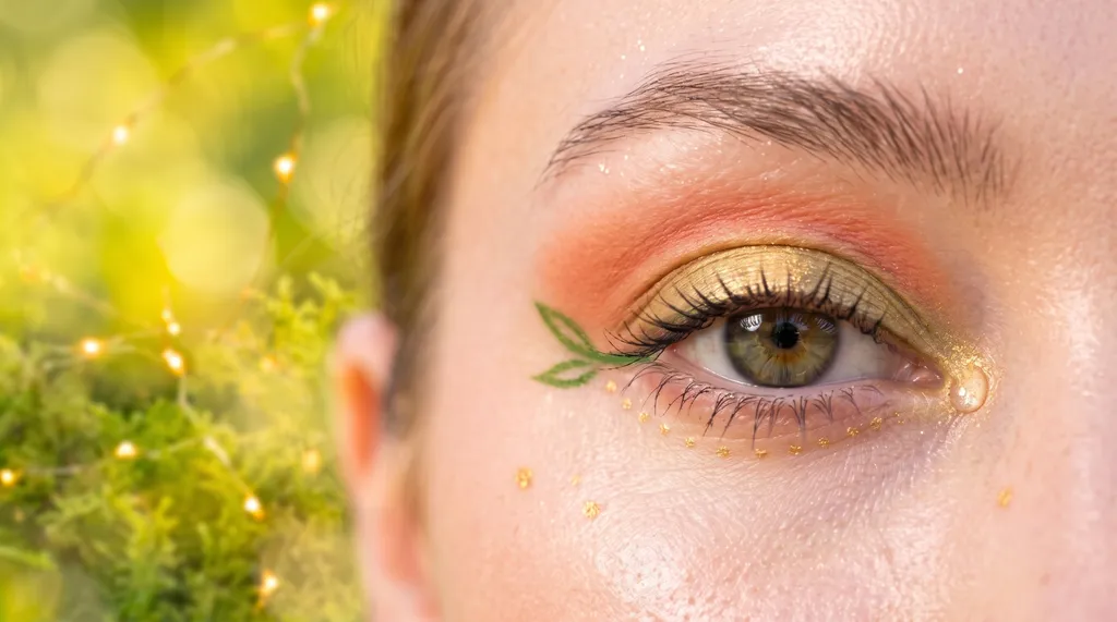
Whimsy accent: With gold liner, dot a row of tiny dots trailing along the lower lash line, evenly spaced like dew on a stem. Add two or three gold freckles at the cheekbone. For the storybook touch, draw one small leaf at the outer corner with the grass-green liner: two short curved strokes meeting at a point.
True Spring Palette
Best Colors
Accent Colors
Wildflower Fae proves fairycore can go fully warm: a golden-green-to-coral wash, a dense marigold glint over the pupil, and one clean stroke of grass green along the lower lash line.
Bright Spring: "Sunlit Sprite"
Most fairycore looks skip graphic elements entirely, but Bright Spring has the clarity to carry a full gradient. A warm gold base fades into an electric turquoise outer lid, with a flicker of true coral prisming the inner corner, then the same gold returns as a concentrated shimmer over the pupil to tie the gradient together. This warm-neutral season is the most vivid in the Spring family, and it can hold this much saturated, clean color without losing the softness that keeps the whole look feeling like fairycore rather than a costume.
Steps:
- Sweep warm gold #FFD700 across the inner half of the lid as the base.
- Blend electric turquoise #00CED1 over the outer half and up into a floated outer crease, blending the inner edge into the gold so the fade reads seamless, no hard line between them. This gradient is the whole look, so keep the transition smooth.
- Tap true coral #FF6B6B at the inner corner only, adding a coral flicker against the gold-to-turquoise gradient so the eye shifts gold-coral-aqua across its length for a lit, prismatic effect.
- Press the same warm gold #FFD700, now in a concentrated shimmer, at the center of the lid, directly over the pupil, to tie the gradient together.
- Clean any fallout from under the eye and diffuse every edge except the gradient's deliberate shift.
- Trace a thin warm-brown line along the upper lash line. Add a fine accent line of electric turquoise along the outer half of the lower lash line for a clean pop of color.
- Finish with dramatic mascara and a glossy warm coral lip.
Whimsy accent: With the turquoise liner, draw two or three tiny four-point sparkle stars at the outer corner, varied sizes, trailing up along the wing line. Add a few gold dots trailing down toward the cheekbone from the outer corner. Bright Spring can carry accents a touch bolder and crisper than the softer Springs; your contrast wants that definition.
Bright Spring Palette
Best Colors
Accent Colors
Sunlit Sprite gives Bright Spring a fairycore look with real prismatic drama: a gold-to-turquoise gradient, a coral flicker at the inner corner, and crisp stars trailing the wing line.
Find Your Fairycore Palette in Minutes
BeautySpark identifies your color season from a selfie and builds a personalized eye makeup tutorial around it.


Summer Seasons: Cool, Soft Fairycore
Summer coloring is cool and often muted, the one season family where the standard fairycore mix's gold shimmer has to go entirely. The lavender and misty tones in that default belong here; the gold does not, so every look below trades it for pure silver instead. That said, treating all three Summer seasons the same would still miss the mark. Light Summer stays delicate, True Summer carries a purely cool clarity that supports fine graphic linework, and Soft Summer's muted palette calls for a scattered, hazy shimmer rather than a bold wash. All three stay cool: lilac, periwinkle, plum, and sage-gray, never gold or peach.
Light Summer: "Moonlit Meadow Fae"
A soft lilac-to-rose two-tone wash carries a whisper of gray-green at the outer corner, finished with a tiny raised bead of glossy, iridescent silver-pearl gel at the inner corner, left unblended on purpose so it catches light instead of diffusing it, like an actual dew drop. Light Summer is the lightest, most delicate season in the cool-neutral Summer family, and silver, never gold, is what keeps this look reading as moonlit rather than muddy.
Steps:
- Sweep soft lilac #B57EDC across the inner two-thirds of the lid.
- Blend cool rose-pink #C08081 over the outer third, melting the two together, then carry the rose-pink just above your natural crease on the outer half, blended up into nothing for a floated lift.
- Add a whisper of muted gray-green #B2BEB5 at the very outer corner only, for a cool, faintly foresty tint.
- Press soft silver shimmer #D9D9E3 in a concentrated point at the center of the lid, over the pupil, plus a smaller tap at the inner corner. Silver, not gold, is the single most important choice in this look.
- Clean any fallout from under the eye, then diffuse every edge before adding the dew accent.
- Dot a small bead of the same silver-pearl gel at the inner corner to mimic a dew drop. Leave it unblended and raised, not smoothed into the skin.
- Trace a thin soft-gray pencil along the lash line, never black, smudged soft. Finish with soft brown-gray mascara and a glossy soft pink lip.
Whimsy accent: Scatter cool-pink or silver freckles high on the cheeks and trail a few from the outer corner up along the wing line. Add a few silver dots under the lower lash line, following its curve, like dew caught in moonlight, and finish with one tiny silver star near the inner corner.
Light Summer Palette
Best Colors
Accent Colors
Moonlit Meadow Fae is fairycore at its softest and most literal: a lilac-to-rose two-tone wash, a silver dew drop at the inner corner, and freckles trailing the wing line like dew in moonlight.
True Summer: "Misty Lavender Fae"
This is the most detailed linework in the Summer family: a fine plum vine curling from the outer corner toward the brow, with two tiny leaf-shaped flicks branching off it. Underneath, a dusty periwinkle-to-plum two-tone wash carries a tap of muted teal at the outer corner, and a cool-pearl shimmer catches light at the center of the lid. It depends on True Summer's clarity: one of the four purely cool seasons, with a balanced, clear coloring that lets a fine line read crisply instead of disappearing into the skin.
Steps:
- Sweep dusty periwinkle-blue #7366BD across the inner two-thirds of the lid.
- Blend soft plum mauve #8E4585 over the outer third, melting the two together, then carry the plum just above your natural crease on the outer half, blended up for a floated lift.
- Tap muted cool teal #367588 at the very outer corner only, for a watery, foresty depth.
- Press cool pearl shimmer #C7C9D9 in a concentrated point at the center of the lid, over the pupil, plus a smaller tap at the inner corner.
- Clean any fallout from under the eye, then diffuse every edge before the linework.
- With a fine liner brush, trace a thin plum-mauve vine curling from the outer corner up toward the brow, adding two tiny leaf-shaped flicks branching off the main line, following the angle the eye's own wing would already take.
- Dot cool pearl shimmer at the tip of one leaf flick. Trace a thin cool-gray or plum line along the upper lash line, smoked softly, with a thin wash of the same plum along the lower lash line.
- Finish with dark cool-toned mascara and a glossy berry-rose lip.
Whimsy accent: Trail a few silver or pale-lilac dots from the outer corner up toward the temple, following the wing line, like a scatter of distant stars. Add a scatter of cool-toned freckles, and if you want the celestial touch, draw a small crescent moon at the outer corner with cool-gray liner. Cool tones only.
True Summer Palette
Best Colors
Accent Colors
Misty Lavender Fae gives True Summer's fairycore look genuine botanical detail: a periwinkle-to-plum two-tone wash, a fine plum vine with leaf flicks, and silver dots trailing toward the temple like starlight.
Soft Summer: "Foggy Forest Fae"
Soft Summer's magic is atmosphere, the fairy glimpsed through mist, so the whole look stays deliberately hazy. A muted sage-gray-to-mauve-taupe wash melts into a soft smoky plum at the very outer corner, with a gentle cool-pearl glow standing in for a spotlight. Soft Summer, a cool-neutral season, carries the most muted chroma of any Summer season, so a bold graphic element would fight the coloring rather than flatter it. The freckles are the one place the whimsy gets to show; everywhere else stays quiet.
Steps:
- Sweep muted sage-gray #9CAEA6 across the inner two-thirds of the lid.
- Blend dusty mauve-taupe #C8A2C8 over the outer third and tap soft smoky plum #B8A9C9 at the very outer corner. Melt all three into each other in tiny circles until you cannot tell where one stops. The seamless melt is the look.
- Carry the mauve-taupe just above your natural crease, blended up into nothing, for a floated lift.
- Press muted cool-pearl shimmer #C9C5C2 gently at the center of the lid, over the pupil. Keep it a soft glow here rather than a bright spotlight, to match the foggy mood.
- Clean any fallout, then smudge soft gray-brown into the upper and lower lash lines, kept hazy with no crisp line anywhere. This is the one look in the guide with no sharp base edges at all.
- Finish with soft brown-gray mascara and a glossy muted rose lip.
Whimsy accent: Match the fog and keep it whisper-soft. Dot a few tiny gray-mauve freckles and two or three subtle pearl dots trailing from the outer corner, following its curve rather than scattering at random. Nothing here should read high-contrast; the whimsy should look like it is emerging from mist, not sitting on top of it.
Soft Summer Palette
Best Colors
Accent Colors
Foggy Forest Fae keeps Soft Summer's fairycore look quiet and muted throughout: a three-tone sage-mauve-plum fog, a gentle pearl glow, and freckles that look like they are emerging from mist.
Autumn Seasons: Warm, Earthy Fairycore
Autumn is the warmest and most muted season family, which pushes its fairycore looks toward an earthier, woodland version of the aesthetic rather than a bright meadow one. Autumn seasons carry warm undertones that make moss green, warm bronze, and deep copper the natural fairycore alternatives to lavender and silver. Soft Autumn stays gentle and muted, True Autumn goes purely warm and rich, and Dark Autumn takes the whole aesthetic into a moodier, dark-fae direction without losing the glow.
Soft Autumn: "Golden Moss Fae"
This reads like sunlight coming through fern leaves rather than a spotlight. A muted moss-green-to-bronze two-tone wash carries a tap of terracotta at the outer corner, with a soft antique-gold shimmer glowing gently rather than flashing at the center of the lid.
Steps:
- Sweep muted moss-green #8DAA7E across the inner two-thirds of the lid.
- Blend soft warm bronze #D2A45E over the outer third, melting the two together, then carry the bronze just above your natural crease on the outer half, blended up for a floated lift.
- Tap muted terracotta #CC8A6B at the outer corner for warm depth.
- Press soft antique-gold #D4B87C shimmer gently at the center of the lid, over the pupil, plus a smaller tap at the inner corner. Keep it a warm glow rather than a hard spotlight.
- Clean any fallout from under the eye, then diffuse every edge before the linework.
- Trace a thin warm bronze-brown line along the upper lash line, softly smudged, with a little along the outer lower lash line.
- Finish with soft brown mascara and a glossy warm terracotta lip.
Whimsy accent: This season loves a sun-freckled fairy. Scatter warm-gold and soft-bronze freckles across the nose and cheeks and trail a few from the outer corner up along the wing line. Add tiny gold dots under the lower lash line, following its curve, and a small leaf or vine flourish at the outer corner in bronze liner if you want it.
Soft Autumn Palette
Best Colors
Accent Colors
Golden Moss Fae gives Soft Autumn a fairycore glow that stays gentle and mossy: a moss-to-bronze two-tone wash, a warm antique-gold glow, and sun-freckles trailing the wing line.
True Autumn: "Amber Woodland Fae"
Where True Summer's vine stays cool and clear, this one reads warm and rich, like it was traced in actual autumn light. A rich copper-to-forest-green two-tone wash deepens at the outer corner with a touch of oxblood, and an antique-gold shimmer catches light at the center of the lid. True Autumn is purely warm, with no neutral lean toward Spring or Winter, and that richness is what lets the gradient and the vine hold this much color without losing their delicacy.
Steps:
- Sweep rich copper #CD7F32 across the inner two-thirds of the lid as a glowing base.
- Blend warm forest green #355E3B over the outer third, melting the two together for the season's hero gradient, then carry the forest green just above your natural crease on the outer half for a floated lift.
- Deepen the outer corner and crease with a touch of oxblood brick #CB4154, smoked outward.
- Press antique-gold shimmer #D4AF37 in a concentrated point at the center of the lid, over the pupil, plus a smaller tap at the inner corner.
- Clean any fallout from under the eye, then diffuse every edge before the linework.
- With a fine liner brush, trace a thin forest-green vine curling from the outer corner toward the brow, with two tiny leaf-shaped flicks branching off it, following the angle the eye's own wing would take.
- Dot antique gold at the tip of one leaf flick. Trace deep warm brown or forest green along the upper lash line, thin and slightly smoked, with forest green along the outer two-thirds of the lower lash line.
- Finish with warm brown mascara and a glossy warm amber lip.
Whimsy accent: Scatter gold and copper freckles, and trail tiny gold dots from the outer corner up along the wing line. The vine-and-leaf flourish at the outer corner is the woodland fae at her fullest; finish it with two or three small curved forest-green strokes and tiny leaf shapes.
True Autumn Palette
Best Colors
Accent Colors
Amber Woodland Fae is Misty Lavender Fae's warm-toned twin: the same delicate botanical linework, rebuilt in a copper-to-forest-green gradient.
Dark Autumn: "Enchanted Forest Fae"
Dark Autumn's coloring is deep, warm, and high-contrast, exactly the kind most tutorials assume cannot do fairycore. It can. A built-up dark-bronze-to-emerald-pine two-tone wash deepens at the outer corner with oxblood wine, smoked outward like shadow between trees, so a rich antique-gold shimmer can glow at the center of the lid like light breaking through a canopy. This is fairycore's moodier, dark-fae register, and it needs Dark Autumn's depth to work: a warm-neutral season with the deepest coloring in either warm family, with enough richness to carry an atmosphere this heavy without the whimsy disappearing into it.
Steps:
- Pack dark bronze #6B4423 across the inner half of the lid, building it until it reads richly. A sheer wash vanishes on this much depth.
- Blend deep emerald pine #228B22 over the outer half, taking both tones more saturated than any lighter season would, then carry the emerald just above your natural crease on the outer half for a floated lift.
- Deepen the outer corner and outer crease with oxblood wine #722F37, smoked outward. This is the shadow in the forest that makes the shimmer glow.
- Press rich bronze-gold shimmer #B36700 firmly at the center of the lid, directly over the pupil, plus a tap at the inner corner. Against the deep green, this metallic reads like light breaking through the canopy.
- Clean any fallout from under the eye, then diffuse every edge before the linework.
- Trace deep brown-black or dark green along the upper lash line. This depth can carry a soft smoked wing where a Light Spring would be swamped by it. Add dark green along the lower lash line.
- Finish with dark brown mascara and a glossy deep amber-brown lip.
Whimsy accent: Trail gold dots from the outer corner up along the wing line; they glint against the depth. Add a vine-and-leaf flourish at the outer corner in gold or deep-green liner, plus a few bronze freckles for the earthy touch. Accents here can be a touch more defined than a soft season's; the depth of the coloring will not wash them out.
Dark Autumn Palette
Best Colors
Accent Colors
Enchanted Forest Fae proves fairycore can go moody: a built-up dark-bronze-to-pine base with an oxblood forest shadow, a canopy-light shimmer at the pupil, and gold dots glinting along the wing line.
Winter Seasons: Cool, Bold Fairycore
Winter is the coolest and highest-contrast season family, which pushes its fairycore looks toward a bolder, more crystalline version of the aesthetic. Winter seasons can carry deeper bases and more vivid accents than any other family without losing the glow, as long as everything stays cool: sapphire, emerald, pine, silver, and amethyst rather than gold or peach. Dark Winter takes fairycore into a moonlit, dark-fae forest mood, True Winter goes for a built-up sapphire-and-emerald high contrast, and Bright Winter turns the palette into its iciest, most jewel-lit register.
Dark Winter: "Midnight Forest Fae"
Dark Winter carries the deepest, most dramatically high-contrast coloring in the Winter family, and it gets told more than any other season that whimsical, soft fairy looks are not for it. They are. Where Light Summer's version of this technique stays pastel, Dark Winter's goes jewel-toned and nocturnal: a built-up pine-to-blackberry two-tone wash deepens into charcoal at the outer corner, so an icy-silver shimmer can glow at the center of the lid like moonlight through trees. It takes this cool-neutral season's depth, the deepest in the whole Winter family, to make that richer color read as genuinely nocturnal instead of muddy.
Steps:
- Pack deep pine emerald #1B4D3E across the inner half of the lid, building it until it reads rich and dark. Sheer vanishes on this much depth.
- Blend blackberry plum #6C2C6A over the outer half, blended into the green, then carry it just above your natural crease on the outer half for a floated lift.
- Deepen the outer corner and outer crease with charcoal black #1C1C1F, smoked outward into a soft, diffused shadow. This is the depth of the forest that makes the next step glow.
- Press icy cool-silver #F5F5F5 shimmer firmly at the center of the lid, directly over the pupil, plus a tap at the inner corner. Against the deep green and plum, the cold silver reads like moonlight through trees.
- Clean any fallout from under the eye, then diffuse every edge before the dew accent.
- Dot a small bead of the same icy-silver gel at the inner corner to mimic a drop of caught moonlight. Leave it unblended and raised, not smoothed into the skin.
- Trace true black along the upper lash line, a clean line or a smoked wing; this much contrast needs that definition. Add black or deep green along the lower lash line, with a smudge of the silver shimmer at the inner lower corner.
- Finish with dark mascara and a glossy deep berry lip.
Whimsy accent: Draw cold silver or white four-point stars at the outer corner, crisp and small, glinting against the dark like stars over a forest, trailing up the wing line. Add a scatter of silver dots from the outer corner toward the temple, and a delicate silver vine-or-leaf flourish at the outer corner if you want the woodland-storybook touch.
Dark Winter Palette
Best Colors
Accent Colors
Midnight Forest Fae is Moonlit Meadow Fae's dark-fae counterpart: the same glossy dew-drop detail, rebuilt in Dark Winter's pine, blackberry, and moonlit silver.
True Winter: "Sapphire Night Fae"
Cool, deep, high-contrast: True Winter owns the coldest, clearest jewel tones, sapphire, emerald, silver, black. Warm pastels make this coloring look ill; cold jewels are the magic instead. A built-up sapphire-to-emerald graduated wing deepens into black at the outer corner, with a whisper of cool amethyst prisming the inner corner, and it is only True Winter, purely cool with the highest natural contrast of any season, that has the clarity to carry that much built-up depth without it turning harsh.
Steps:
- Pack deep sapphire #0F52BA across the inner half of the lid, building it until it reads richly. Sheer washes vanish on this much depth.
- Blend cool emerald #046307 over the outer half into a graduated wing shape extending from the outer corner, blended into the sapphire with no hard line, then carry the emerald just above your natural crease on the outer half for a floated lift.
- Deepen the very outer corner with a touch of black #14171C, smoked outward. This depth wants boldness; don't be timid with it.
- Press cold silver shimmer #E6E6FA in a concentrated point at the center of the lid, directly over the pupil, plus a tap at the inner corner. The icy metallic against the sapphire is your starlight. Add a whisper of cool amethyst #6A0DAD at the very inner corner for a jewel prism.
- Clean any fallout from under the eye, then diffuse every edge except the deliberate graduated wing.
- Trace true black along the upper lash line, a clean defined edge or a smoked wing; this much contrast carries either. Add sapphire or silver along the lower lash line.
- Finish with dramatic black mascara and a glossy cool berry lip.
Whimsy accent: Draw crisp silver four-point stars at the outer corner and trail a scatter of silver dots toward the temple along the wing line, like a night sky. Add one tiny sapphire or amethyst dot in the cluster. Keep every accent cool-toned; warm gold breaks the spell here.
True Winter Palette
Best Colors
Accent Colors
Sapphire Night Fae is Sunlit Sprite's icy opposite: a built-up sapphire-to-emerald graduated wing, deepened with black, lit by a single point of cold silver starlight and a whisper of amethyst at the inner corner.
Bright Winter: "Crystal Frost Fae"
The highest, clearest contrast of anyone, cool, bright, icy: muted pastels don't just underwhelm on Bright Winter, they fight the season's clarity and read tired. This look is made of frost and jewels instead, a bright icy-white canvas, a vivid sapphire jewel over the outer half, and a prismatic tap of amethyst at the inner corner. Bright Winter's looks stay crisp and clean where soft seasons blur, and that crispness is the whole point. Don't dilute it.
Steps:
- Wash icy silver-white #F5F5F5 across the whole mobile lid. Bright Winter carries brightness like no other season, so start bright rather than muted.
- Press vivid sapphire #0F52BA onto the outer half of the lid, blended toward the center. Keep it clear and clean rather than smoked out; clarity is the signature here.
- Tap bright amethyst #8B00FF at the inner corner or lower inner lash line, so the eye reads as multi-jewel.
- Press bright silver shimmer #C0C4CC in a concentrated point at the center of the lid, directly over the pupil, bright and reflective.
- Clean any fallout from under the eye, then diffuse every edge except the deliberate sapphire-to-white shift.
- Trace true black along the upper lash line with a clean, defined wing for sharp clarity. Add bright sapphire along the lower lash line.
- Finish with dramatic black mascara and a glossy cool berry lip.
Whimsy accent: This is where Bright Winter shines, literally. Draw crisp silver or white four-point stars at the outer corner, varied sizes with sharp points, trailing up the wing line. Add silver dots trailing outward like frost, with one tiny amethyst dot among them for a jewel-scatter. Keep the whimsy clean and bright, matching the season's natural crispness, not soft.
Bright Winter Palette
Best Colors
Accent Colors
Crystal Frost Fae takes fairycore to its iciest and most jewel-lit: a bright silver-white canvas, a vivid sapphire jewel, and a prismatic tap of amethyst, finished with crisp frost-white stars.
Quick-Reference: Fairycore Looks by Season
| Season | Look Name | Base Technique | Key Shades |
|---|---|---|---|
| Light Spring | Dawn Meadow Fae | Dewy Petal Wash | Peach blossom, light coral, warm apricot, honey gold |
| True Spring | Wildflower Fae | Gossamer Shimmer Point | Golden chartreuse, warm coral, marigold, grass green |
| Bright Spring | Sunlit Sprite | Butterfly Wing Flick | Warm gold, electric turquoise, true coral |
| Light Summer | Moonlit Meadow Fae | Opal Dew-Drop Accent | Lilac, cool rose, sage green, cool pearl silver |
| True Summer | Misty Lavender Fae | Vine & Leaf Graphic Liner | Periwinkle, soft plum, soft teal, cool pearl shimmer |
| Soft Summer | Foggy Forest Fae | Freckle & Dot Scatter | Sage gray, soft mauve, smoky plum, muted pearl shimmer |
| Soft Autumn | Golden Moss Fae | Gossamer Shimmer Point | Moss green, soft bronze, soft terracotta, antique gold |
| True Autumn | Amber Woodland Fae | Vine & Leaf Graphic Liner | Bronze, warm forest green, brick red, warm gold |
| Dark Autumn | Enchanted Forest Fae | Freckle & Dot Scatter | Dark bronze, forest green, wine, deep copper |
| Dark Winter | Midnight Forest Fae | Opal Dew-Drop Accent | Deep pine, rich plum, charcoal black, icy silver |
| True Winter | Sapphire Night Fae | Butterfly Wing Flick | Sapphire, emerald, deep black, cold silver, amethyst |
| Bright Winter | Crystal Frost Fae | Gossamer Shimmer Point | Icy white, vivid sapphire, amethyst, bright silver shimmer |
For a moodier alternative aesthetic built on the same season-by-season structure, see the goth eye makeup guide or the smoky eye color season guide.
Every fairycore technique works for any season once the palette is swapped to match undertone, depth, and chroma. Glowing skin, iridescent shimmer, and a nature motif stay constant throughout.
How to Adapt Fairycore Makeup to Your Eye Shape
Every look in this guide can be adjusted for your eye shape without changing the palette. The color stays the same; the placement shifts.
Almond Eyes
Almond eyes have a natural balance between lid space and crease visibility, which makes them the easiest shape for any of these looks. Apply the wash as written and let the vine, wing, or dew accent sit exactly where the tutorial places it.
Round Eyes
Round eyes show more white above and below the iris. Concentrate the wash and any graduated wing at the outer corner and blend it into a slightly elongated shape rather than packing color evenly across the whole lid, which can make round eyes look even rounder.
Hooded Eyes
Bring the wash and any shimmer placement higher above the crease so the color stays visible with eyes open. For the vine and wing looks, keep the linework slightly higher than the tutorial photo shows.
Monolid Eyes
Skip the crease entirely and focus on lid coverage with the gradient running from inner to outer corner. The dew-drop and freckle-scatter looks translate especially well, since neither depends on crease definition.
Upturned Eyes
Upturned eyes have a natural lift at the outer corner, which suits the wing looks particularly well. Extend the wing's gradient along the natural upward angle rather than fighting it.
Downturned Eyes
Extend the wash and wing gradient slightly upward at the outer corner rather than following the natural downward slope, which lifts the whole look.
Protruding Eyes
Keep the wash in a matte or satin finish where possible and concentrate the shimmer accent at the inner corner rather than the center of the lid, which reduces forward projection.
Close-Set Eyes
Concentrate the deepest part of the wash at the outer corner and keep the inner-corner highlight or dew accent light and bright, which opens the space between the eyes.
Wide-Set Eyes
Bring the wash and any shimmer scatter closer to the inner corner and nose bridge to visually close the gap. The vine and freckle-scatter looks both work well here since the detail naturally draws the eye inward.
Deep-Set Eyes
Keep the deepest shade at the lash line only and bring the lighter or shimmer shade onto the center of the lid to pull the eye forward rather than letting it recede further.
For a complete guide to eye-shape adaptation for all makeup techniques, see the eye shapes guide.
The palette stays matched to your season; only the placement shifts to flatter your eye shape.
Frequently Asked Questions
Get Your Fairycore Look, Matched to Your Season
BeautySpark builds a personalized eye makeup tutorial from a selfie, matched to your exact color season.